Archive for January, 2012

Feeling productive!

Posted in Uncategorized on January 29, 2012 by stingersix

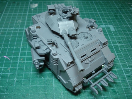
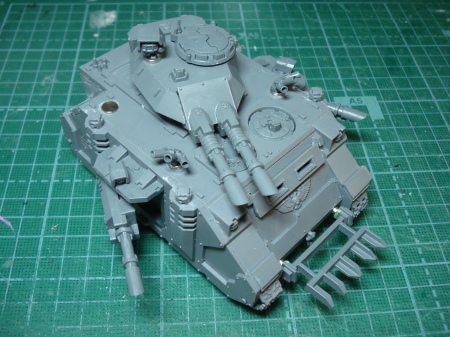
So I have that Predator underway (primed it this afternoon). I also have a Razorback kit I was going to do after the Predator, but I figured why wait and put it together last night. The Razorback is magnetized too, though with far fewer magnets than the Pred (of course). I can magnetize things pretty quickly now – at least it seems quick. Anyway, that’s also primed and I’ll get down to actually painting these over the next couple weeks.

And if that’s not enough, I got a Space Marine Librarian that I’m prepping for priming.

And converting some las-plas weaponry for the Razorbacks.

Just a burst of energy at the moment.

Magnet Madness! Rhino/Razorback/Predator

Posted in WIP with tags , , , on January 26, 2012 by stingersix

So I got myself a Predator, and of course, since it’s built on a Rhino chassis, I knew I was going to magnetize the hell out of it so I could switch between Rhino, Razorback and Predator. Now that I have done so, I think it’s brilliant that the model was designed with this potential.

Magnetizing all the pieces required twenty-eight 1/8″ and seventeen 1/4″ magnets (at 1/32″ thickness) and took me two evenings to do, so maybe 6 – 8 hours of work total.

Consider the humble Rhino, before it gets all dressed up.

I put a stack of magnets inside the door wells. They’re just high enough to contact the magnets glued to the doors.

The sponson mount doors have 1/4″ magnets on them, which give a good solid contact with the magnets in the door wells. The regular Rhino doors have a 1/8″ magnet mounted on a piece of sprue cut to the right length and stuck to the door.

Magnetizing the sponson weapons was also somewhat challenging. I cut off the pins on the weapon mounts themselves and glued 1/8″ magnets on the ends. This was pretty fiddly. The result was not so strong so I added a thin strip of green stuff wrapped around them and this is more sturdy. I went slow and measured and checked everything before gluing stuff in. The sponsons were the most time consuming.

I added these magnets on the front so I could attach the hedgecutter.

I’ve seen solutions for magnetizing the turret that involve a piece of sprue glued onto the mounting plate. I wanted to use this as a Razorback as well and gluing a spar in place would block the weapons in that configuration. So to enable both set-ups, I glued a piece of sprue inside the turret and put a magnet on that. Then I cut another piece of sprue just longer than the diameter of the hole in the turret ring mounting plate and put a magnet on that. This way I can attach the Predator turret and it stays on, and easily remove it if I want to put in a Razorback gun mount.

Here are the main guns. I cut the pins off the mantles and put in the magnets.

The turret was a little difficult. The magnets went in easily since the holes were already about 1/8″. I had to back them up with some greenstuff. The piece of sprue on the front there keeps the guns from drooping, and that meant I had to cut a small piece out of the inside of each gun mantlet which was hard to get right.

Here’s the finished product.

The 1/4″ magnets on the top of the hull and turrets allow mounting of smoke launchers, searchlights and other accessories. The rear of the turret is magnetized so the ammo bins can be changed depending on which main gun configuration I’m using. The storm bolter is also magnetized so that I can put on the pintle mount or the hull mount.

So in the end I think it was worth the work as I now have three vehicles in one!

I need to order more magnets!

Samurai-themed Space Marines, Pt.4 – Kumadori

Posted in Minis with tags , on January 14, 2012 by stingersix

This is going to be the last of my posts on how I’ve gone about giving my Space Marines a samurai theme without actually modifying the silhouette of the models themselves. I’ve talked about using kanji and samurai crests. The last thing I’ve done is gone for painting a kumadori design on the faces of Marines who aren’t wearing their helmets. Kumadori come from the Japanese traditional theater art of kabuki, which I’m sure you’re all aware of.

The idea here is, upon becoming full Battle Brothers, each Rising Sun Space Marine has his face tattooed with a kumadori design (tattooed because you don’t want greasy face paint getting all over the inside of your helmet when you put it on). I was initially a bit apprehensive about trying this, since I knew it would be difficult. On the other hand, I would only do it for bareheaded minis so it wouldn’t be too much work. The other consideration was, I didn’t want them to look too unnatural – not like Chaos warriors or something.

The cool thing about kumadori designs is, first, there are so many of them. Second, the colors have some symbolic meaning. Red, for example, is heroic and passionate, blue can stand for ghosts and spirits, and so on.

To actually paint it, first I paint the head and face in normal flesh tones. Then I go over it with a thin coat of white that’s translucent enough so the flesh color shows through just a bit. Then I go in and do the kumadori design. This is really an exercise in brush control and while I’m generally happy with the results I do wish I could do better.

At any rate, it gives my minis a distinctive look that also makes them stand out on the table.


Samurai-themed Space Marines – Pt.3: Banners

Posted in Blather, Minis with tags , , on January 9, 2012 by stingersix

Moving on with how I’ve developed the theme of my RIsing Sun Chapter colors, as I mentioned, once I actively starting building out a force I realized I needed to expand the colors and heraldry a little. Since I’m not converting the minis to actually look like samurai, I needed something that would still set them apart as such. I accomplish this two ways – with the banners and the kabuki-style face paint designs. For this post, I’ll talk about the banners.

In our history, samurai clans each have a mon, a symbol that adorns everything from clothing to teapots to battle standards. When considering what to put on the Space Marine back banners, this was the logical choice. There are plenty of references for these mon online, so all you need to do is pick one you can execute with a brush. The designs tend to be circular, in that they generally can be drawn inside of a circle, although some designs don’t have a circular shape. They also tend to be geometric, but again there can also be intricate designs of birds, flowers or other natural things.

Of course, you can go crazy grabbing all the designs you can find, but I decided to set a few rules for how the Rising Suns display their heraldry. I’ll get to that in a bit.

There is a Chapter Banner of course. In this particular case, I’m using the banner I painted over 20 years ago.
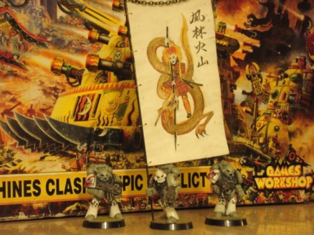
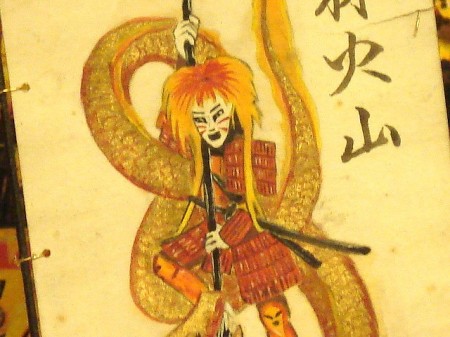
I freehanded this. The character is Hachiman, the first Chapter Master of the Rising Sun, depicted here slaying the dragon of Chaos. As I previously noted, I had a friend who could do Japanese calligraphy write the chapter motto on the banner.

It’s a different design direction than the more stylized mon I’m using for the individual Marine’s back banners, but since this is the Chapter standard, I think it’s okay. The emblem of the Chapter, if distilled down to a mon, is the Rising Sun.

The model itself is an old metal Marine. I plan on getting a Command Squad or Honor Guard at some point and transferring the banner over to the newer minis. When I do, I may spruce the banner up a bit, but I like its old weatherbeaten appearance.

And just because I could, I did a micro version of the standard for my Epic scale Marines.
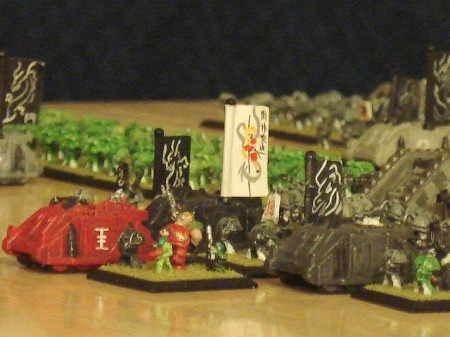
OK, on to the mon designs. The idea is, these are personal heraldry. The Rising Sun Chapter recruits from the best warrior clans of its homeworld, Kamakura, and each of these clans has a family crest. When a Brother Marine becomes a Sergeant, he is allowed to display this crest on his back banner when in charge of a squad. If a Brother Sergeant becomes a Brother Captain, his crest becomes the company crest and is displayed on the company standard (as well as the Captain’s own standard).

These vehicles show the company commander’s mon.
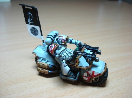
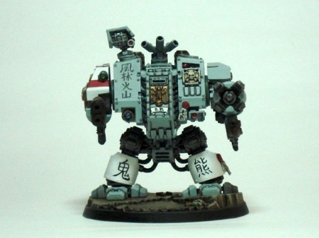
The dreadnought also displays his own personal heraldry (on the red banner).
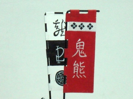
On the company standard, the company commander’s name is at the top (Ryu), the company number in the middle, and the commander’s personal mon on the bottom.
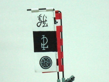
And here are some individual crests.
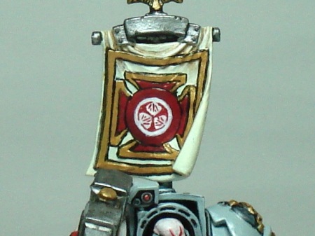
You may be wondering, “How the hell do you paint those?” Very carefully! Kidding aside, though it’s not exactly easy, it’s less difficult than you might think. I don’t have any pics of the painting process (and I should take some) but basically it’s like this.

1) Paint a black circle on the banner

2) Paint white lines on black, drawing out the design.

Because the designs are often geometric, you can often lay out the design by marking points where the line intersect. Then as you connect the dots, the design becomes clear. The company mon, for example, looks very intricate when done, but is accomplished with three lines a circle and then picking out detail.

Next post, I’ll talk about the kumadori facepaint designs.

Samurai-themed Space Marines – Pt.2

Posted in Minis with tags , , on January 5, 2012 by stingersix

In the last post, I explained the background of my Space Chapter paint scheme and the motto they use “Furinkazan”. For the longest time, that was about all I did if and when I painted Marines in these colors. I wasn’t actively collecting the minis or playing the game so I didn’t feel any drive to expand on things. But when I did at last get into the game, I realized I needed to expand the heraldry and colors a bit.

When you sit down to paint your minis you need a plan, at least if you want them to look like a cohesive force on the table. The basic colors of the individual Rising Sun Marines is what I drew from. Everything in the Chapter armory would have the same base color – grey – and gold trim. These two colors go well with the red and white of the Chapter emblem, and so I use this color palette for all my models. On the table, this gives my force a unified look.

Even with slightly different color, such as on the Chaplain, the Chapter colors still link him to the main force.

I write Japanese kanji characters all over my minis now, but the one character I try to find a place for on each figure or model is 「風」kaze (wind). This is another element that ties my force together visually.

Now as far as kanji goes, I’ve talked about how I do it in other posts, but I have to say that it’s damned hard to do them that small. Most of the time, the characters wind up being illegible, but unless you look at them very closely, it doesn’t matter much – the basic shapes are apparent and create another visual element that sets my Marines apart. The Chaplain is a good example. I tried to write Buddhist death sutras on the tabards and banners and whatnot, but because they’re so small you can’t really read them (sorta). I was pleased with the overall effect though – the vertical writing looks good.

Now, all of this doesn’t exactly make my Marines “samurai”, at least visually. For that, I used samurai family crests, called mon. I’ll talk about that in my next post.

Samurai-themed Space Marines – Pt.1 – Furinkazan

Posted in Blather with tags , , on January 4, 2012 by stingersix

I’d guess that shortly after Warhammer 40,000: Rogue Trader was released back in 1987 and the first boxed set of plastic Space Marines came out, people have been doing samurai-themed Marines. When I got my first boxed set of beaky boys 25 years ago, I decided I would do a samurai-themed Chapter and laid down the basic color scheme I still use today.

That 40K armies and Space Marine chapters often echo real world historical military colors and designs is no accident and it’s one of the things I enjoy about the minis. I like the Roman designs found in the Ultramarines and the Norse theme of the Space Wolves. GW obviously likes them too since they actually model the miniatures to look that way. But for samurai-themed Marines, making them actually look like samurai, you have to convert.

Many samurai Space Marine conversions are about actually changing the silhouette of the model to look like an armored samurai. I have seen some very good ones over the years and a quick google images search turns up these and these. Those are really great conversions and my hat’s off to the guys who did them since they look like they took a fair amount of work. Nowadays, Kromlech makes things a little easier by providing samurai heads and backpacks that can quickly alter the basic Marine silhouette into a samurai warrior. Ah, where were these 25 years ago? Anyway, until now, silhouette-altering conversions had to be done entirely from scratch.

Way back when I was just a young nerd, I didn’t have the modeling skill to do such conversions. But one thing I did know was Japanese. So I used this knowledge to create (well, “borrow from history”) a range of insignia and markings that would make it clear my Marines had a Japanese (if not a samurai) theme. So while the silhouette of my Marines was not altered, they still would stand out from the generally European influenced colors and designs most often seen on Space Marines.

I started first of all with writing kanji characters on each Marine. I tried a couple of different things before I hit on the design I use today – the Furinkazan motto. This is the maxim, if you will, of the famous Sengoku era warlord Takeda Shingen. Takeda himself got it from Sun Tzu.

Fu (風) “Move as swift as the Wind”
Rin (林) “Stay as silent as a Forest”
Ka (火) “Attack as fierce as Fire”
Zan (山) “Be immovable like a mountain”

I realized I could paint these four characters on the Space Marine armor. I tried it and it worked and I’ve done it this way ever since.

I actually evolved this scheme out of an earlier design. In place of the kanji I originally had “RDK” which stood for “Reptile Deth Korps”… c’mon, it was the ’80’s, what can I say. I’m just happy I made the jump to kanji!

It’s evolved only a little over the years. Certainly, my understanding and ability to write in Japanese has improved as well. Here are some of my early Marines. I painted these guys and their banner back in around 1991 or 1992 – can’t remember for certain.

I’ve tweaked the colors just a little – using gold for the trim now rather than grey, but as you can see it’s still the same – rising sun on the right shoulder, white greaves and grey armor. I hand-painted the Chapter banner and had a friend who could do Japanese calligraphy actually write out the Furikazan motto on the banner. The image symbolizes the first Rising Sun Chapter Master, Hachiman, slaying the dragon of Chaos.

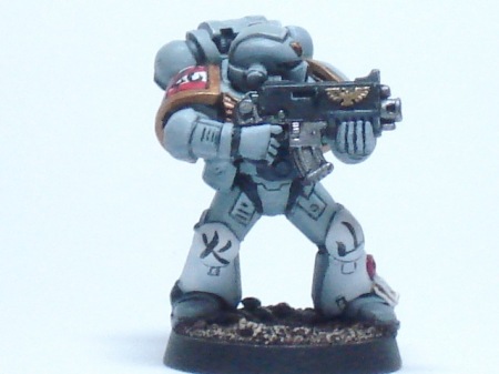
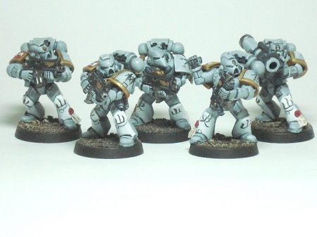
So a squad of Marines in the current Chapter colors is like this:

And as I paint more Marine models and their equipment, I’m writing the motto all over the place:

That’s the evolution of one of the core aspects of my Space Marine Chapter colors. I do find it does stand out and looks good on the tabletop. By using this and other words and phrases written in kanji, I can create a look that sets my Marines apart yet maintains the familiar Space Marine silhouette that everyone instantly recognizes. They go, “Oh, Space Marines,” then look a little closer and go, “Hey, did you write all that?”

Yes I did! 🙂

More about samurai Space Marines next time!

2012! Go!

Posted in Blather, Minis with tags , , , , on January 2, 2012 by stingersix

Ah, a new year and a fresh start for gaming in 2012! I plan on painting and gaming like crazy all year!

Last year I got into 40K after a decades long absence, mostly because I love the minis and I’ve been deep into running the 40K RPGs (Dark Heresy, Rogue Trader, Deathwatch). My collection of Space Marines continues to grow and I’m making a New Year’s resolution out of this. Basically, I’m going to try and paint one unit, vehicle or character per month until I feel I’m done. Even if I don’t hit this goal, working toward it will keep me busy.

In fact I’m already working on a unit of Sternguard. I have five of the metal models and I made five more out of Tactical Marines and a bunch of bits.

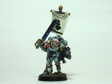
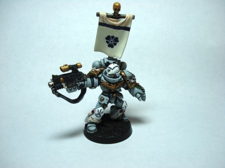
I finished this guy today (base isn't painted but the model itself is done). Pretty happy with how this came out.

The mon on the banner is the personal insignia of this veteran sergeant.

These are the plastic ones. The combi-meltas and combi-flamer are converted from bolt guns, storm bolter magazines and flamer and melta bits. Extra purity seals, Terminator honors and other little bits help add to the bling.

Combi-melta and combi-flamer. Turned the exposure all the way up since these are only primed at the moment.

All the arms are magnetized so I can switch things around. For example, this guy can now carry a heavy flamer. Apologies for the lousy focus, but at least you can see what was done.

I keep putting off building and painting a Predator tank. Given how often they appear in my list, I really need to do this.

And I had another game of Tomorrow’s War last week. It was another learning game and I indeed learned a lot. It’s got some of Stargrunt’s DNA, but it’s not Stargrunt. Battles between forces with a disparity in troop quality can seem pretty one-sided, but can actually be pretty balanced depending on the mission objectives. I played the basic scenario out of the book with Chris R. and my handful of mercs were thrashing and smashing the Altairian rebels.  But even so, just one good round of fire from the rebels and I would definitely have lost. For the rebel player with the crappy troops, it can be frustrating to fire and fire and just get smacked by overwatch fire from superior troops, and this could be a sticking point with many players. Until you understand and get on board with the idea that this is what the game intends to show, it might be a bit hard to swallow.

At any rate, we discovered (near the end of the game) that we were forgetting a pretty important rule (suppressive fire), which will probably change things a lot when we implement it properly next time. The action-reaction chain got a little tricky too, especially when overwatch is used, so we’ll probably need another couple of games to get this one all figured out. I’m looking forward to it though!

So, here’s to 2012!